

AANGAN
आंगन
When the team from Aangan Resorts
approached us for a rebrand, the brief was
rooted in a potent feeling.
It's something most of us have experienced at some point. You check into a hotel and suddenly feel the pressure of it all.
THE IDEA
Aangan was built for people who want none of that.
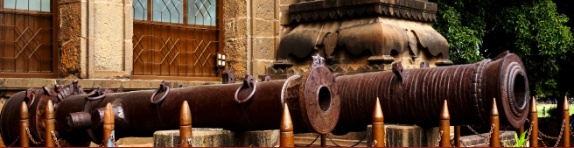
They wanted to create a place that feels like home, but without the responsibilities that come with it.
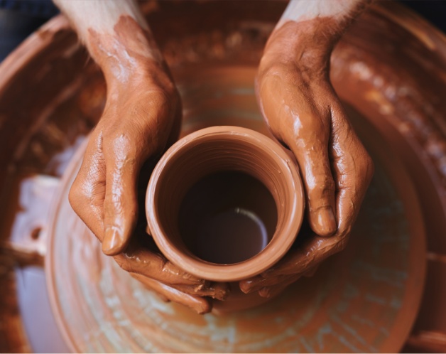
EXPERIENCEThe comfort, the warmth
The comfort, the warmth
and the ease of simply being,
without any expectations or
responsibilities.
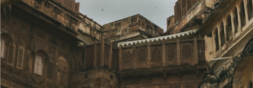
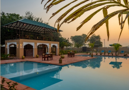
BRAND VISION
To be Rajasthan's most beloved courtyard. Where rooted culture, gentle luxury, and nature's rhythms make every guest feel sat home.
BRAND IDENTITY
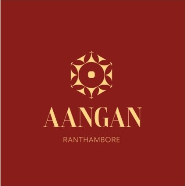
Maroon#3891DA
Cream#fffbe6
Green#C9A96E
TYPOGRAPHY DISPLAYAanganPlayfair Display · 400
BODYWarmth, culture,
gentle luxury.Playfair Display · Italic · 400 LABELBRAND IDENTITYGeneral Sans · 300
gentle luxury.Playfair Display · Italic · 400 LABELBRAND IDENTITYGeneral Sans · 300
MOODBOARD
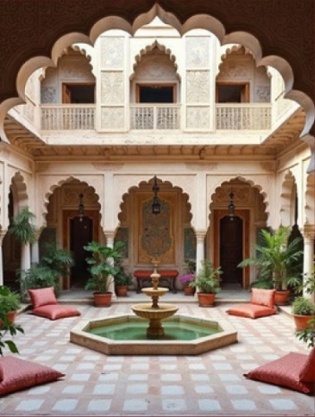
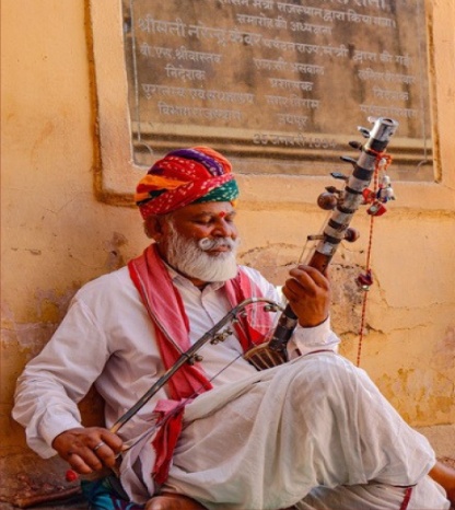
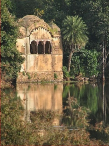
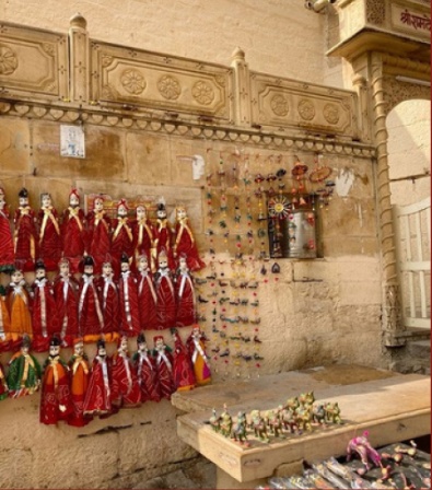
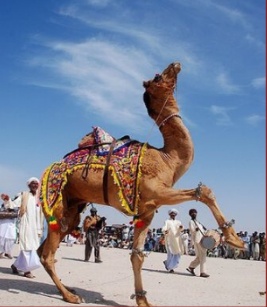
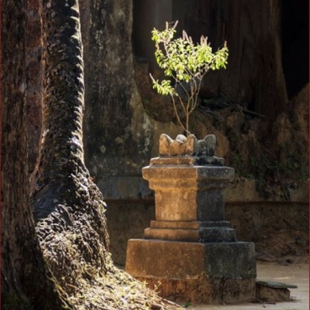
PHOTOGRAPHY & SOCIALS
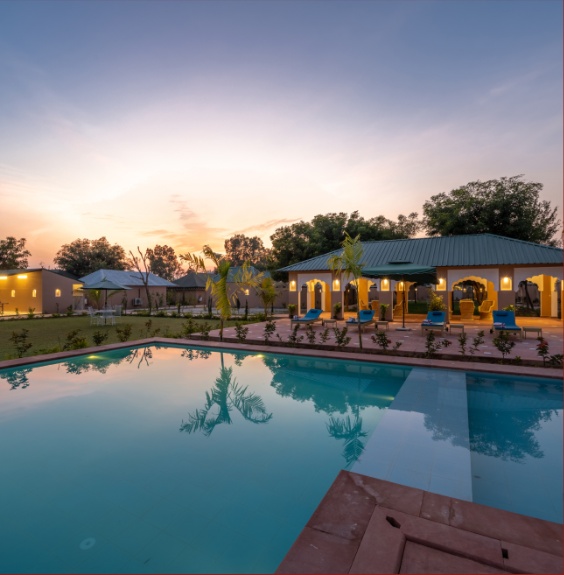
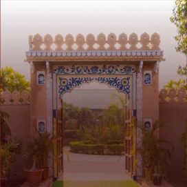
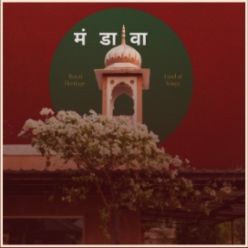
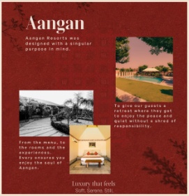
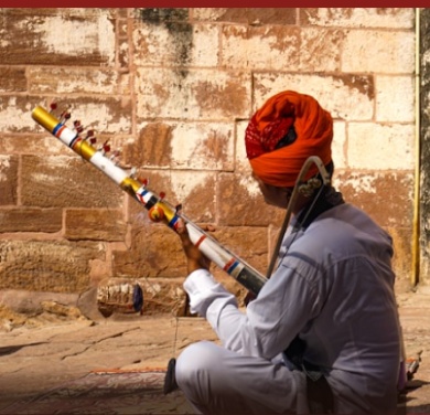
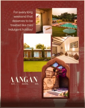
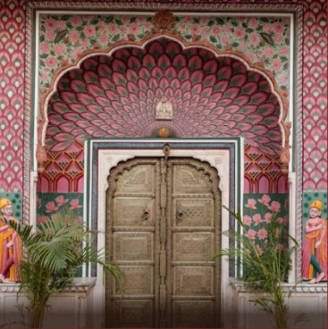
VIDEOGRAPHY
FOR WAY FINDINGS & SIGNAGE + ASSETS
